
Canadian Adaptive Climbing Society (CACS)
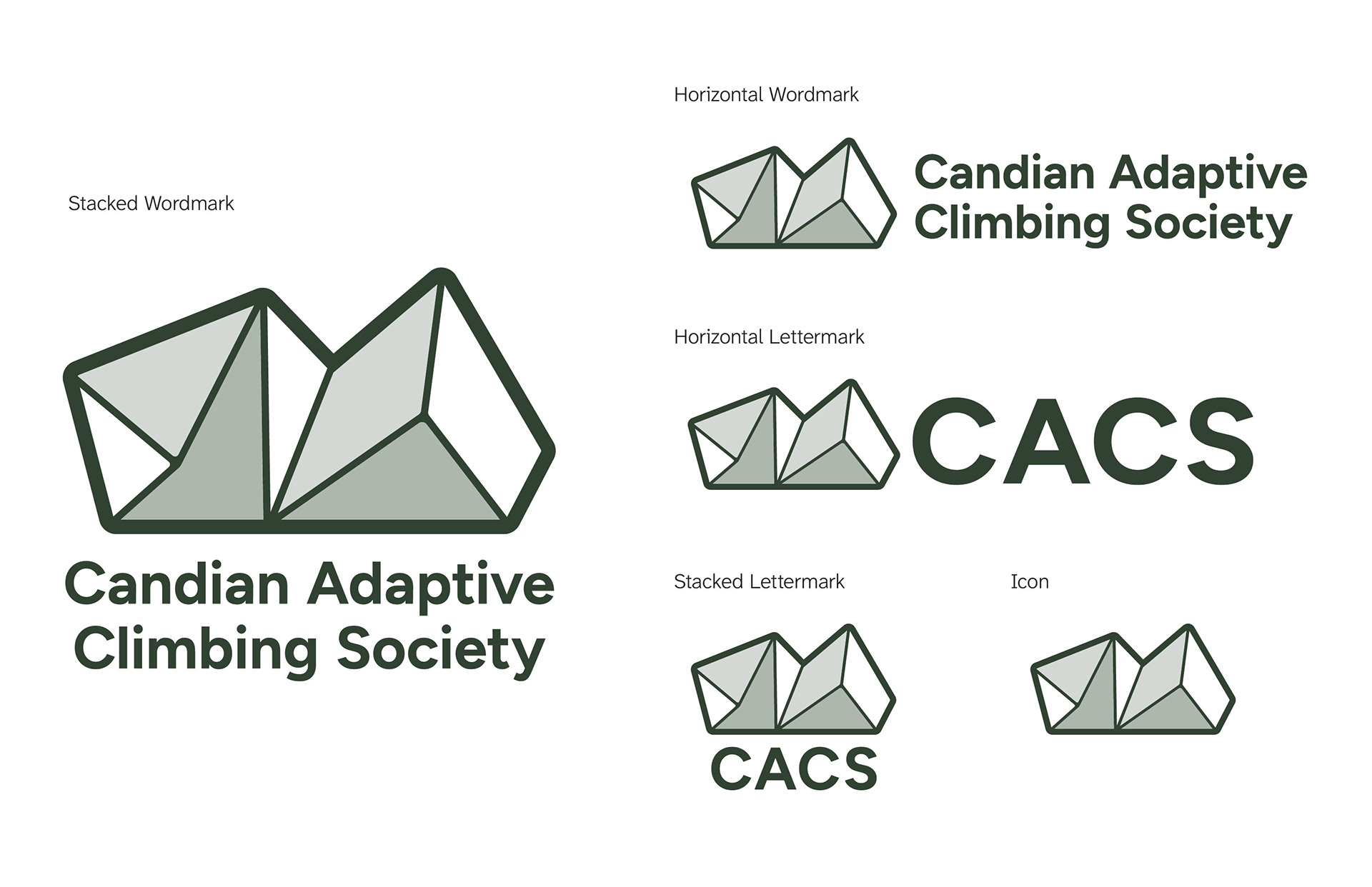
Accessibility-First Brand System
Academic Thesis Case Study
Academic Thesis Case Study
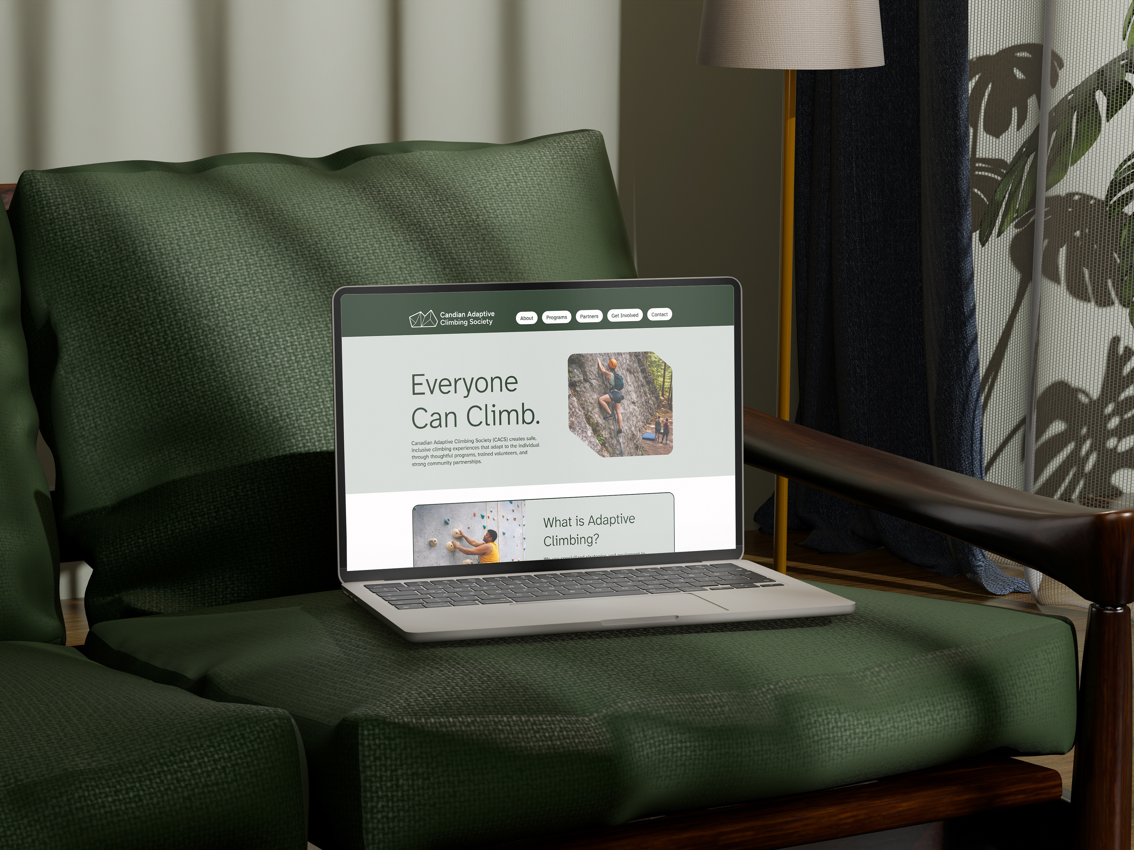
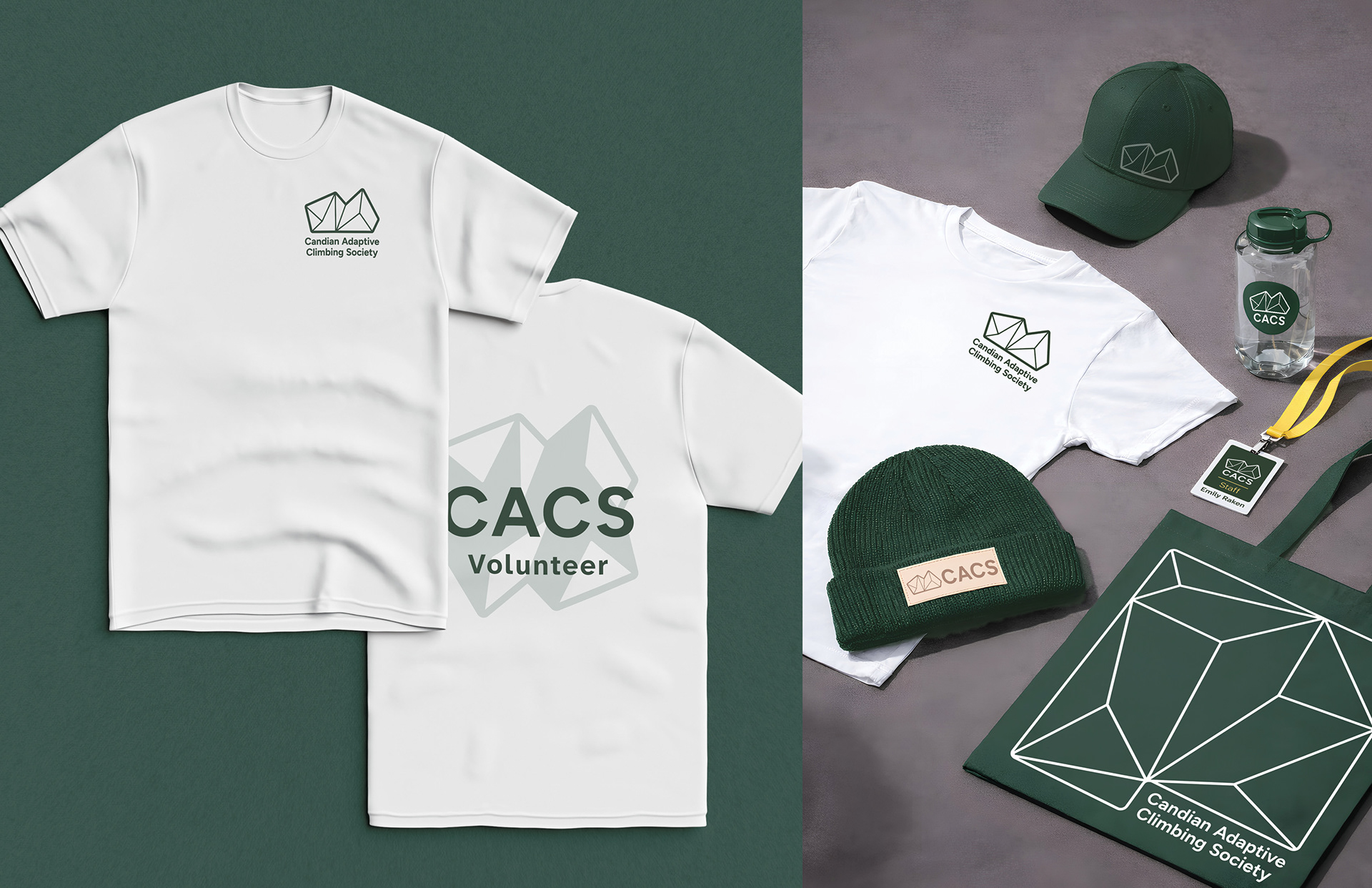
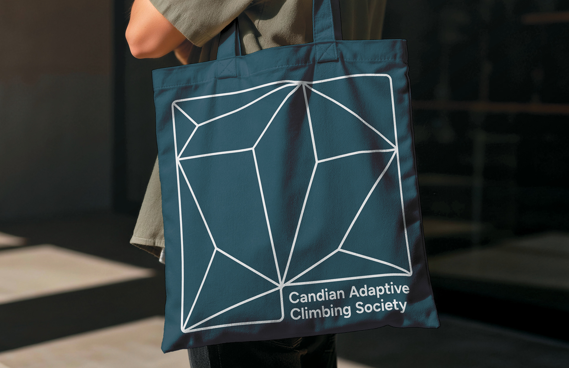
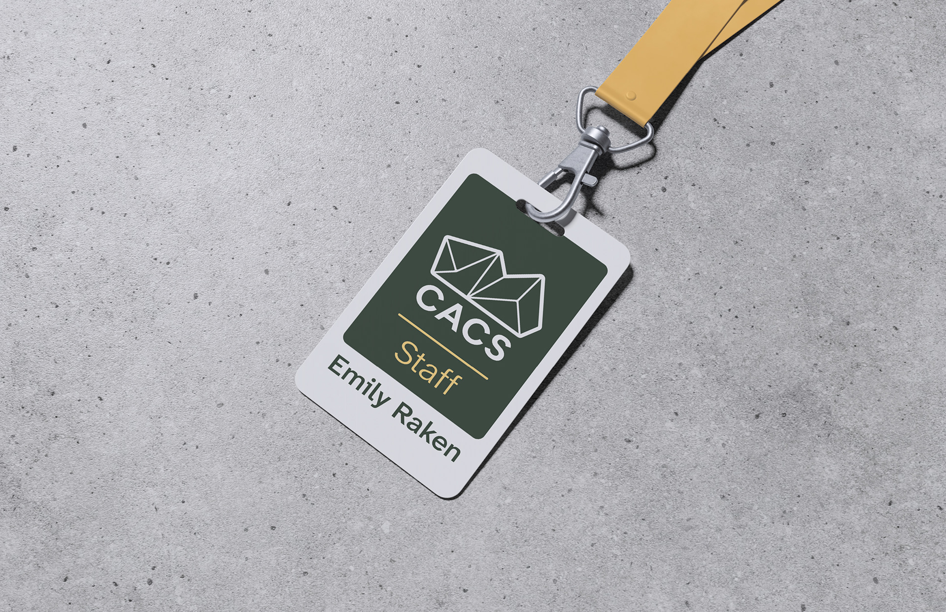
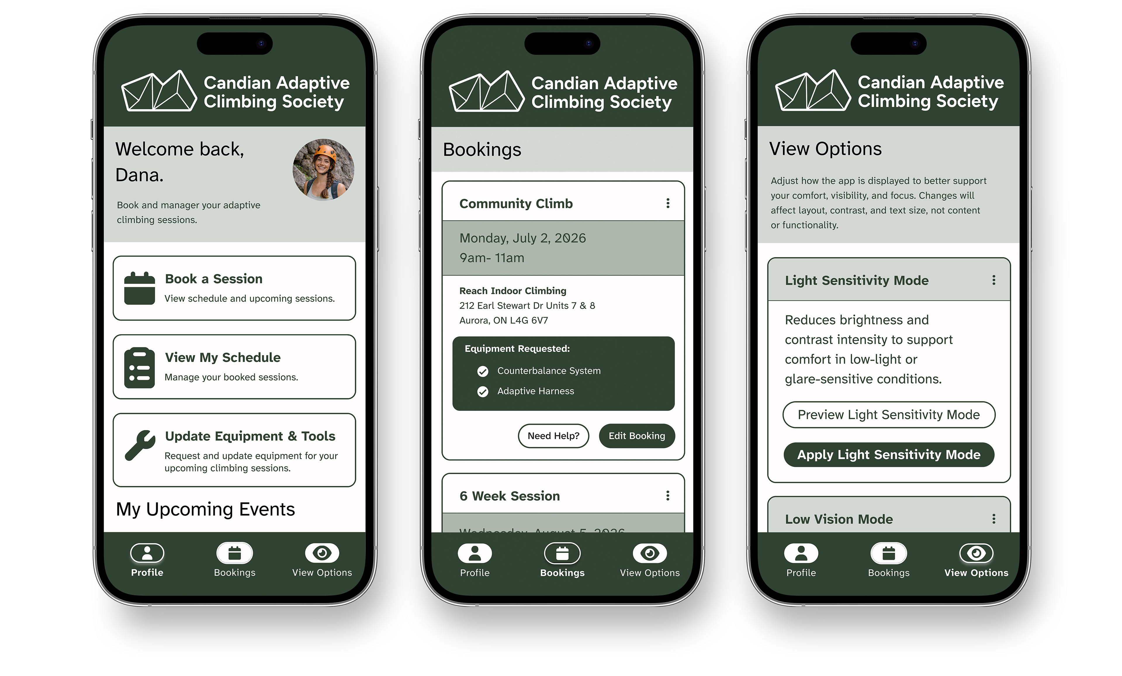
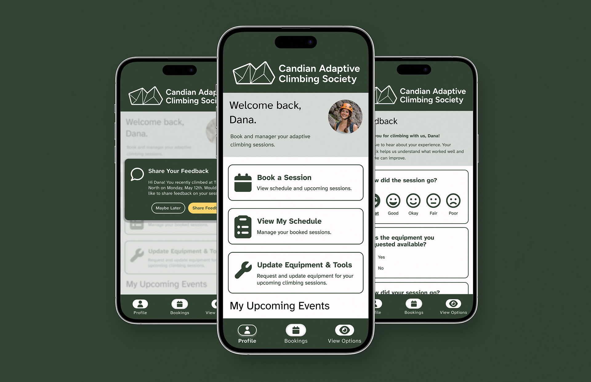
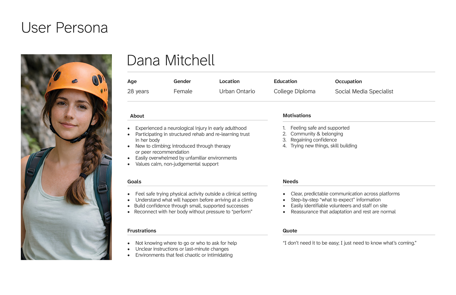
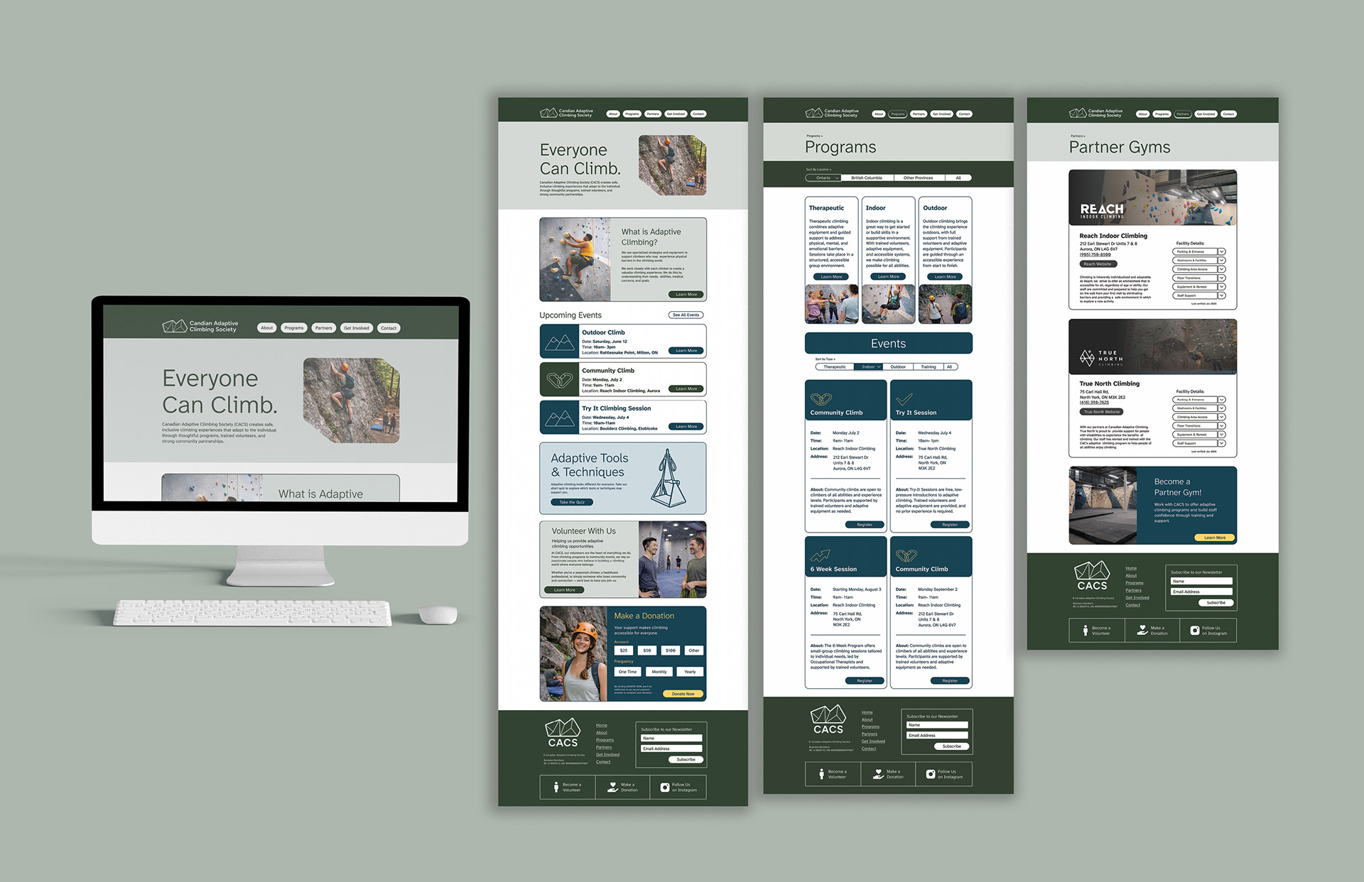
This project explores how accessibility can shape a complete brand and communication system for an adaptive sport organization. Using CACS as a case study, the goal was to reduce barriers through clarity, predictability, and strong visual hierarchy across print, web, and mobile.
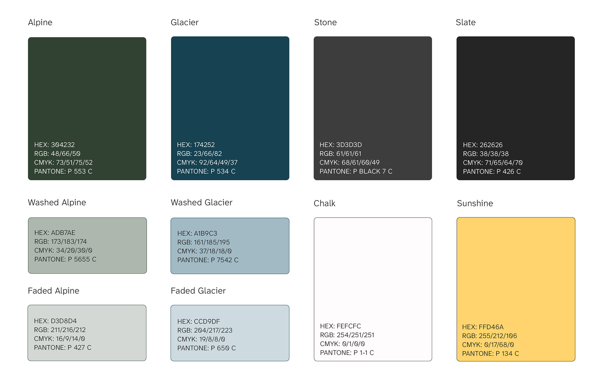
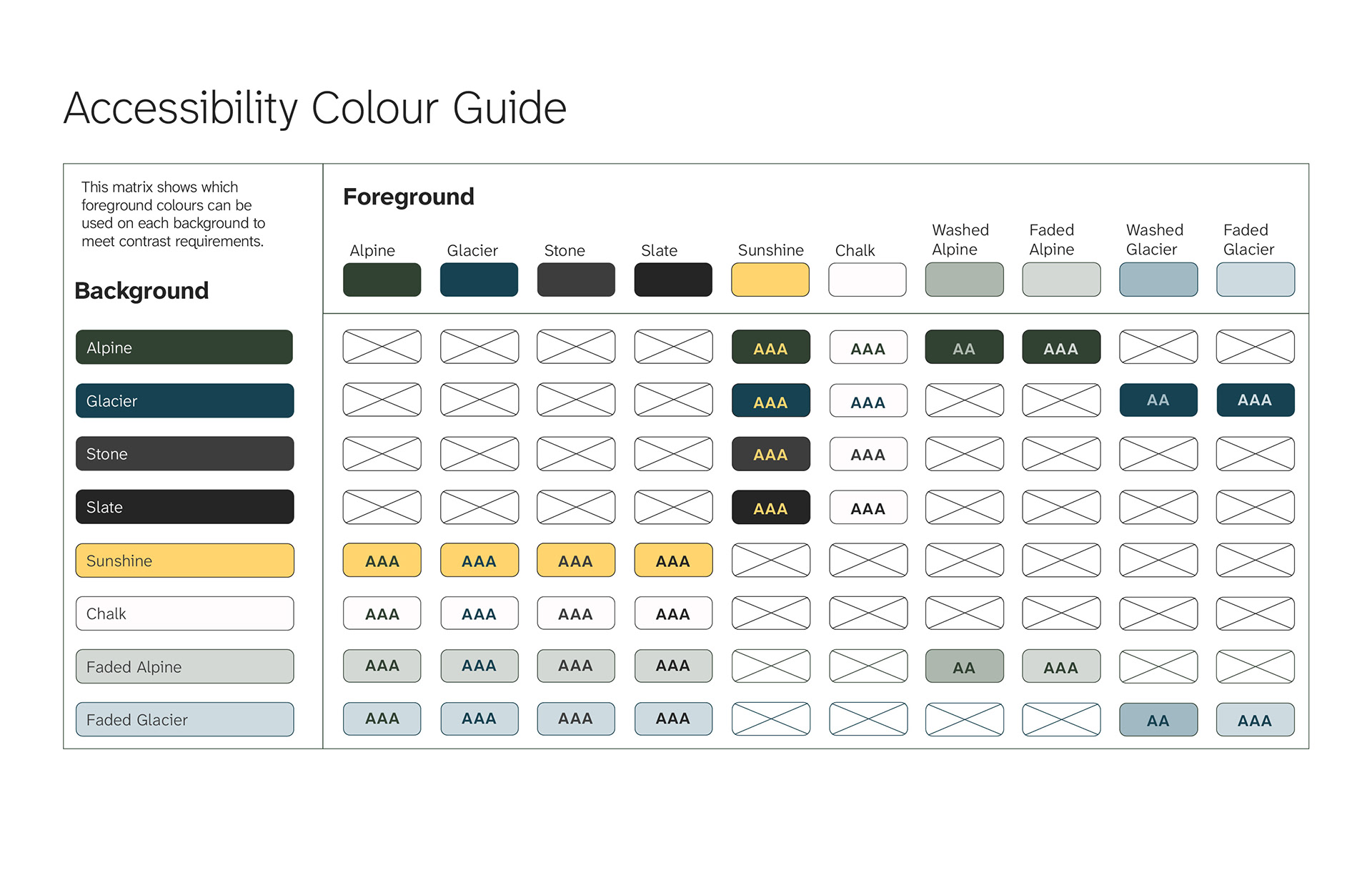
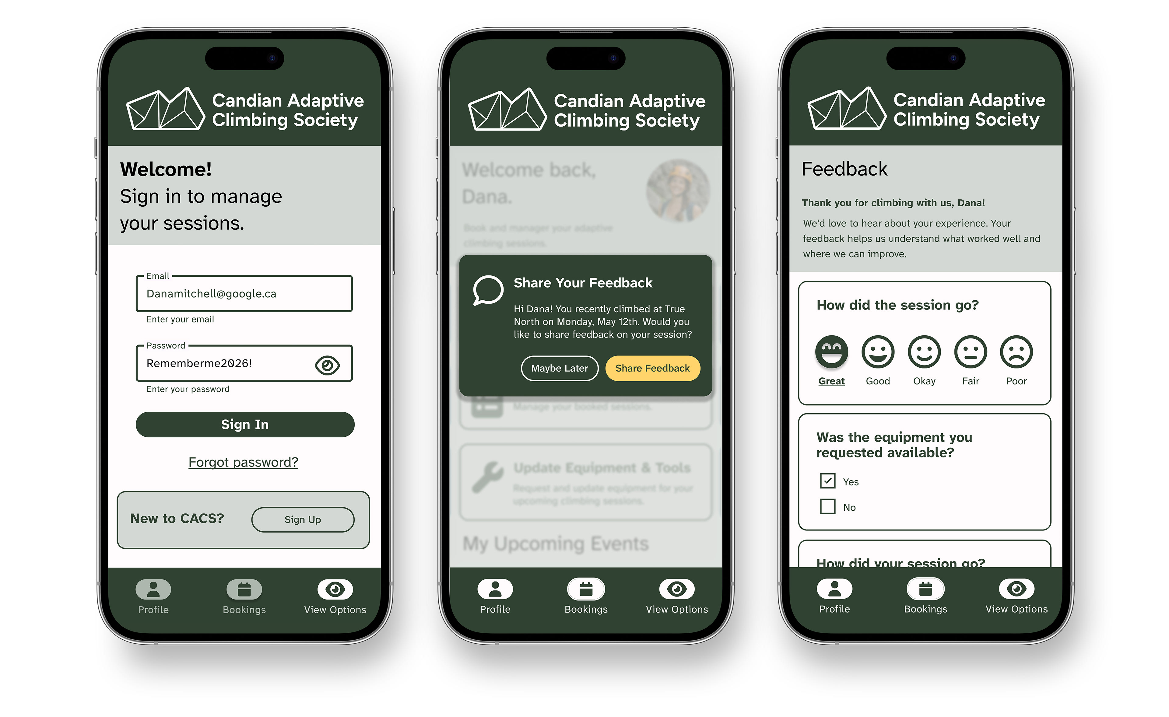
Accessibility guided every decision; from AAA colour contrast standards and a tested foreground/background matrix, to the use of Atkinson Hyperlegible type, large default sizing, and structured, task-based layouts. Interfaces were tested in colour-vision deficiency and low-vision simulations to ensure information never relies on colour alone.
The result is a cohesive, repeatable system designed to reduce cognitive load and support confidence before, during, and after participation.
This is an academic project and does not represent official work created for or endorsed by CACS. View the full brand guide here.
This project is a fictional, academic design exercise created for thesis purposes and does not constitute official work, endorsement, or representation of the Canadian Adaptive Climbing Society. All photography shown is AI-generated and does not depict the Canadian Adaptive Climbing Society, its programs, facilities, or equipment.
Photography: AI generated by J.Sutherland via. Chat GPT (user name: jensutherland199864)
Mock ups: Envanto or AI generated via. Chat GPT (user name: jensutherland199864) licenses
Illustrations: J.Sutherland (Jensutherland.ca)
Application Icons: Font Awesome, Google Materials
Photography: AI generated by J.Sutherland via. Chat GPT (user name: jensutherland199864)
Mock ups: Envanto or AI generated via. Chat GPT (user name: jensutherland199864) licenses
Illustrations: J.Sutherland (Jensutherland.ca)
Application Icons: Font Awesome, Google Materials